Why Does Resident Evil 4 Remake have Yellow Paint?
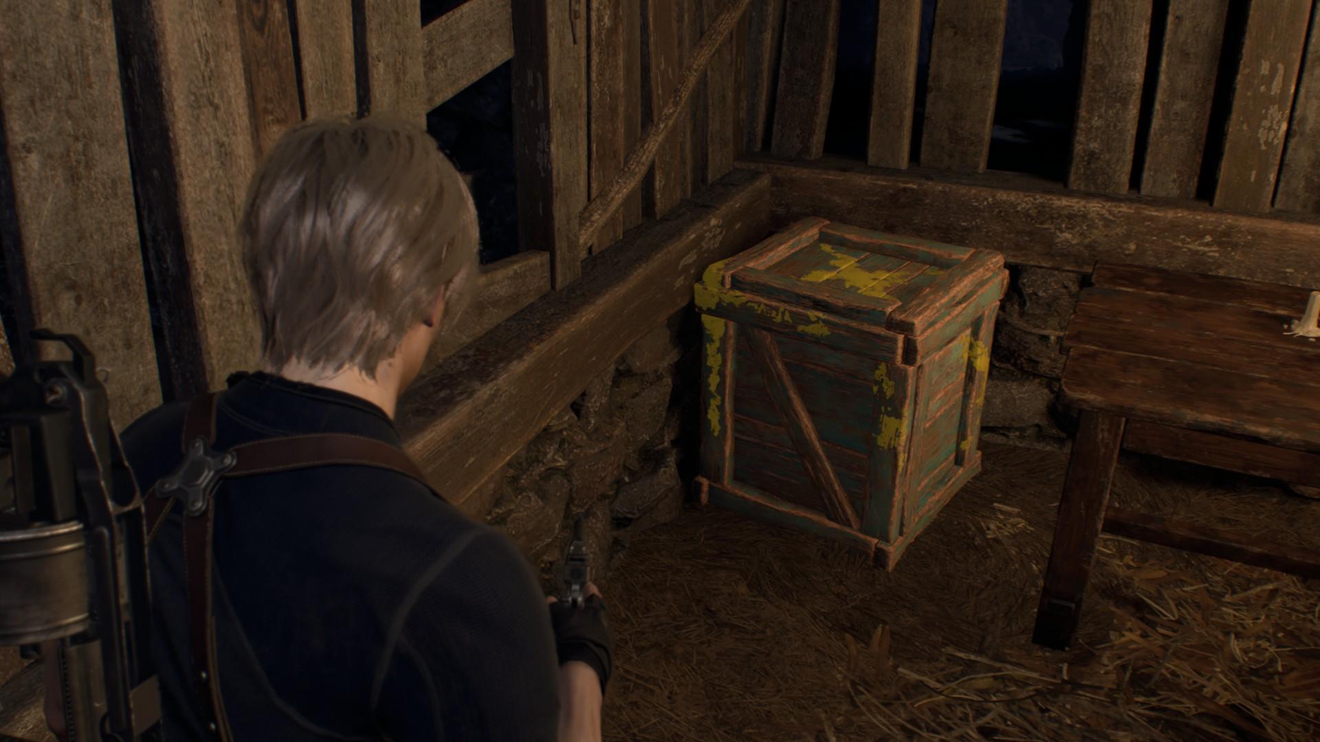
Amongst the earned praise that Resident Evil 4 Remake has been getting on reviews and from players, there have been many points of feedback. One side issue that has come up is the Ubisoft-flavored school bus yellow paint that’s splashed across every breakable barrel and crate as well as marking some key routes. This whole discourse generally settles around games being accessible and how to be more creative with older mechanics.

The Heaviest criticism against Ubisoft paint is how it feels to cater to entry-level players but instead of making it appear like something that can be affected physically and fits in the game the designers cut the corner and apply yellow as a tell-all for anything that the player can interact with. It’s a strategy to contest the ever-increasing level of detail and visual noise that new graphic fidelity and technology are capable of each leap. The same principle has been applied in other areas as well, in the shooter games Valorant and Overwatch characters’ silhouettes are emphasized by a shaded silhouette. More common than not games especially survival horror will use a dynamic highlighting shader to show players what items they can interact with by tracing their outline. The only downside is that this does give the game a digital overlay that can take away from the tactile vulnerable environmental artwork at work. It makes sense then that Resident Evil 4 Remake instead uses small icon markers that are lightly noticeable until the player is right next to it.
Resident Evil 4 Remake uses Ubisoft yellow paint but also has its own low-footprint marker system for interactable objects. Well, not just that there are many other visual signifiers that the game employs that are much more intuitive and cognitively engaging than following yellow paint trails. If anything it makes the problem even more upsetting than it actually is because Resident Evil 4 Remake already includes much more pleasant visual tools that serve the same purpose as the awful yellow paint in the same game!

Once the game progresses into the story’s castle area, we stop seeing so many rotted-down crates and barrels. The castle is populated instead with ceramic vases. They serve the same function as the barrels and crates being destructible through melee strikes or other damage to drop items. Like the wood, on the barrels and crates, the ceramic of the vases has been textured to match the marbled stone of the estate and blends in with the color palette. Despite this, the vases lack the yellow paint that is so present on the barrels and crates. It makes sense that after getting the player familiar with the function of breakable objects it doesn’t need to be so aggressive with its signaling.

There are already options to help blend it into the environment design while still keeping it noticeable. One of the first visuals players might have familiarized themselves with when they saw the Resident Evil 4 Demo was the Los Plagas Sigil during the opening sequence with the village swarm. As the final villager leaves, the camera holds onto the door where an effigy of the holy parasite has been carved out of wood. Similar to the conspiratory Umbrella logo appearing throughout the Resident Evil series to clue in the malevolent corporation’s involvement, the Yellow paint could be used with the Los Plagas Symbol to make a production stamp for all the barrels and crates that the village produces. I think this could help play into the narrative of the story as well.

Another example of colored markings is the Fan Favourite Resident Evil 4 Merchant, back with a different voice actor but putting in work for the same character. You always know his shops are nearby with his purple-flamed torches burning above his venue. The purple glow is otherworldly but it’s sparse enough and not too outside of the possibilities of primitive chemistry to break the theme of the story. He is a trader of strange materials, so possessing the metals or chemicals needed to make the special flames is well within reason. He also sports a grimy rough voice and has occasional coughing fits so it even hints that he’s been in the business of hazardous merchandise for a while, perhaps he was one of Umbrella’s suppliers for the Los Plagas laboratories. Who knows. He does seem to have executive access to all areas of the estates and a truce or repellant towards the evil residents.

For survival horror fans the puzzle of map navigation is part of the fun of the genre. Finding the optimal route is about time, enemy behavior, and equipment. In Resident Evil 4 Remake the different difficulty modes also come with some modifications to the puzzles. I think for players seeking the more rustic approach to the game it would be nice to have an option if guiding elements like yellow paint, were an option to turn on and off. Not out of spite but preference. UI and UX design is important for readability in games but they can also be a divider between the vividness of the game world and the player experience. The game Zero Dawn Horizon, a game that was jabbed over the same discourse of accessibility vs world design during Elden Ring‘s launch, does have extensive options for customizing what and when UI elements are active on the screen. It’s also common for games to have a “skip tutorial” option as well as added or removed gameplay guidance.

Regardless if it’s a non-issue or if you have a position on a hill to die for, having the option for players to adjust their own experience especially when such different experience levels exist allows them to adjust their own pacing within the intended design.
For more great Horror Game Articles, News, and Reviews keep reading at Dread XP


